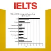
📊 Bar chart: Comparing the average percentages of income spending in two years which are fifty years apart
The bar chart provides information about how families in a country spent weekly income in both 1968 and 2018.Summaries the information by selecting and reporting the main features, and make comparisons where relevant.Write at least 150 words.-Get full episodes of our IELTS Writing Task 1 and 2 episodes: https://linktr.ee/ieltswfsMaria's IELTS writing course: https://course.yourielts.net/ielts-writing-courseListen to our IELTS Speaking podcast: https://linktr.ee/ieltssfsOur social media: https://linktr.ee/successwithielts© 2021 Success with IELTS Hosted on Acast. See acast.com/privacy for more information.
Podzilla Summary coming soon
Sign up to get notified when the full AI-powered summary is ready.
Free forever for up to 3 podcasts. No credit card required.
Listen to This Episode
More from IELTS Writing for Success

📝 Task 2: A growing number of people are trying alternative medicines. Is this a positive or a negative development?
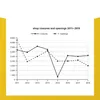
📊 Graph: Number of shops closures and openings between 2011 and 2018

📝 Task 2: Should professionals, such as doctors and engineers, be required to work in the country where they did their training?

📝 Task 2: Taking risks in professional and personal lives
Get summaries like this every morning.
Free AI-powered recaps of IELTS Writing for Success and your other favorite podcasts, delivered to your inbox.
Free forever for up to 3 podcasts. No credit card required.